• 开源镜像
  • 开源沙龙
  • 媛宝
  • 猿帅
  • 注册
  • 登录
  • 息壤开源生活方式平台
  • 加入我们

开源日报

  • 2018年8月20日:开源日报第165期

    20 8 月, 2018

    每天推荐一个 GitHub 优质开源项目和一篇精选英文科技或编程文章原文,欢迎关注开源日报。交流QQ群:202790710;微博:https://weibo.com/openingsource;电报群 https://t.me/OpeningSourceOrg


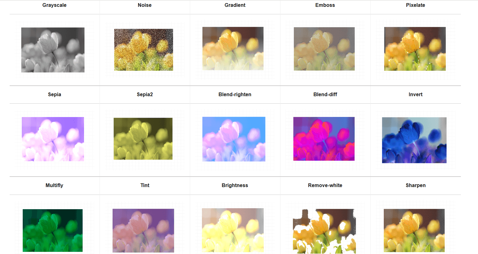
    今日推荐开源项目:《TOAST 图片编辑器 TOAST UI Image Editor》传送门:GitHub链接

    推荐理由:TOAST 系列的新作出场了,这次是一个图片编辑器,可以让你直接调节不同的选项来更改图片,有的网站上会需要这样一个编辑器的,但是记住太过于细致的东西这个编辑器可做不来,还是交给 PhotoShop 这种专门处理图片的好。


    今日推荐英文原文:《Advanced ReactJS Tutorial: Best Practices for (React + Redux + Sagas) Used In A Simple App》作者:jelo rivera

    原文链接:https://medium.com/@jelorivera08/another-react-tutorial-best-practices-for-react-redux-sagas-19d62851725

    推荐理由:作者通过一个小程序作为例子来指导读者更好的理解 React

    Advanced ReactJS Tutorial: Best Practices for (React + Redux + Sagas) Used In A Simple App

    I remember when I started learning React. I always had the anxious feeling that I could never learn everything I needed to, the ever-changing JavaScript language looming over my head, and if I ever did get something right, I would always end up asking myself, was it really the best way to do it? Btw, this tutorial requires a basic understanding of reactJS and everything in between

    After literally hundreds of online tutorials, Youtube searches, and unfinished (and most likely unwashed) cups of coffee, I finally had a firm grasp of what React tries to bring into the JavaScript table. However, I have always struggled to find a tutorial that bundles all the advanced concepts of React into one compact tutorial. That is the gap that this article is trying to fill. This is my first time writing about what I learned so bear with me.

    Enough with the chit-chat. Let’s talk code. Download the finished code from this repo and follow the README so you can see and feel what we are going to build here. https://github.com/jelorivera08/react-starter-pack.

    Landing page of the app

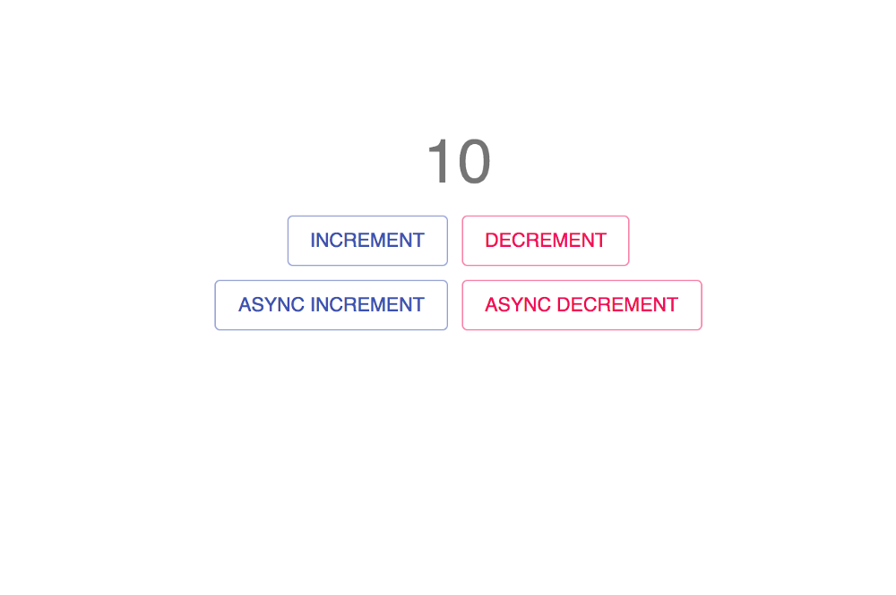
    Here, you can see the count state displayed and four buttons that trigger their respective actions. Their actions are self-explanatory.

    selectors

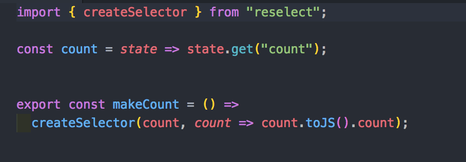
    Head on to the selectors.js file inside the Counter container, the first advanced concept we are tackling here is the createSelector. By looking at the code, first, we fetch the count state inside the redux state tree using state.get(‘count’). Then, we create a selector using the said method. This helps us format the state/data that we receive from the redux state tree and by doing this, we save a lot of time coding new functions that handle state restructuring or formatting the target state every time we need it to render something in the front-end. In this example, I didn’t alter the state that I received. I just returned the plain state for demo purposes. Then, the resulting function will be used inside the mapStateToProps, and with mapStateToProps, naturally, the next thing to configure is mapDispatchToProps.

    create actions

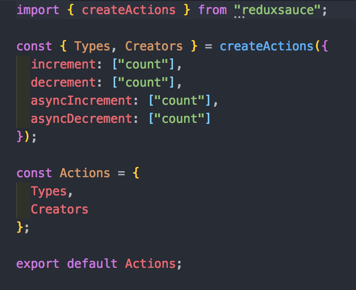
    Whenever dispatching reducer actions, we always have to declare its type and the corresponding switch case to a reducer that it will enter later in order to change the application state. With the createActions package from reduxsauce, we can hit two birds with one stone. We should also format the reducer with reduxsauce in order to fully benefit from this package.

    reducer

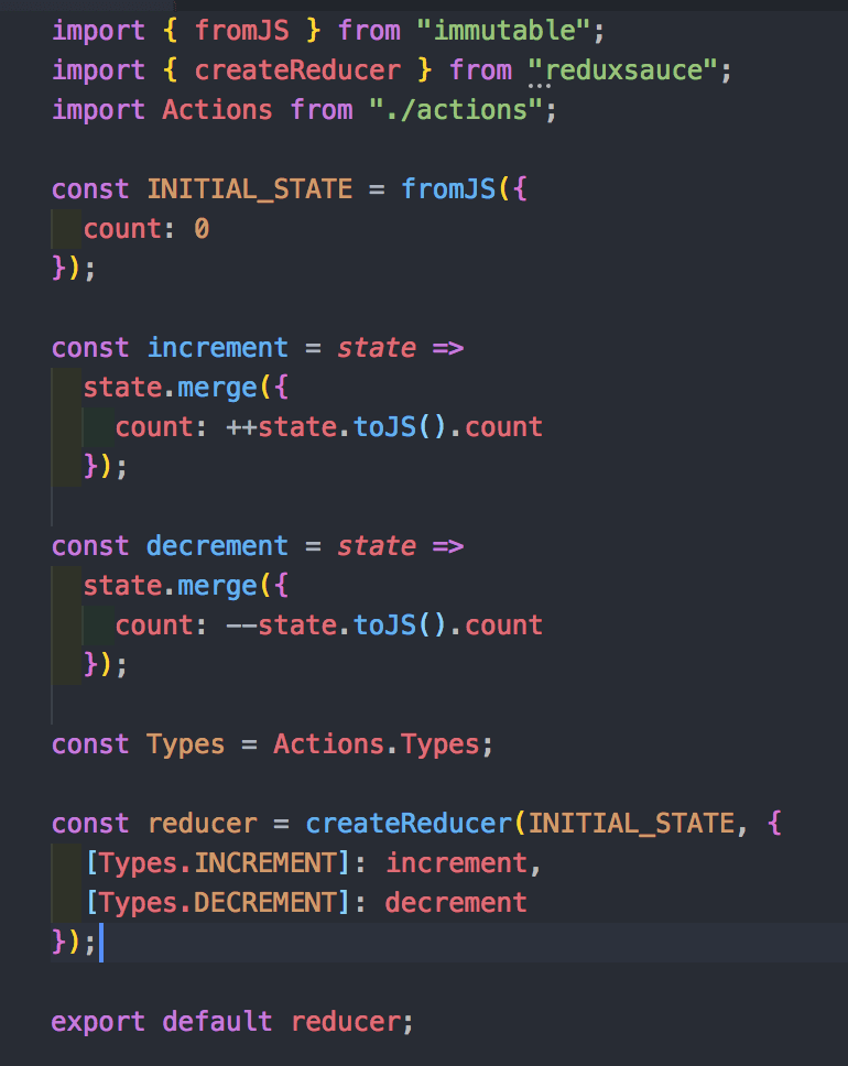
    Above is our app’s reducer. The initial state is enclosed by the fromJS API from immutable and as the package name applies, it protects the initial state from being mutated. React is very strict with this concept so always keep this in mind. the createReducer API from reduxsauce has two arguments. First, the initial state. Second, the object that has keys for action types and values as a function that the reducer will fire once a type matches a dispatch call. Merge, then, changes the redux state tree accordingly. There’s no real life app that doesn’t know how to handle asynchronous API calls right? Right.

    redux saga

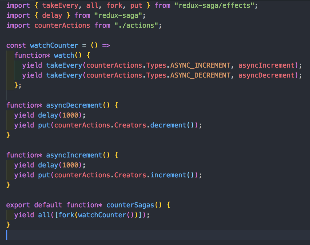
    Here is the saga part of our program. Everything is the same except for the way we call our actions. We make use of the type action that we created earlier and utilise them inside our watcher saga in order to dispatch asynchronous calls that which will later affect our redux state tree. The delay is there to mock network latency for a much better async feel of the app. Oh, and lastly, let’s make sure we don’t forget about performance.

    code splitting

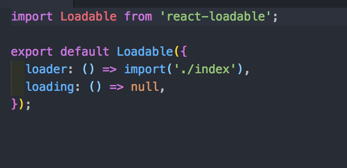
    Code splitting is a great way of improving web application performance. JavaScript code takes the most toll on a user’s data. Remember that, so with code splitting, it lets the end-user download only the part of the code it needs for data consumption efficiency.

    In conclusion,

    There are a lot of packages and tools out there that helps us, software engineers create a cleaner and a much more efficient code. However, it comes with a cost, the cost of understanding the underlying system and that is thinking in React. Learning React requires you to shift your coding paradigm into a much more different one compared to the previous mind-set of coding in front-end. The tools & packages I’ve discussed in this article encapsulates those principals needed in order to code beautifully and efficiently in React and that’s what makes an exceptional developer. It’s always the little things. With that, I hope I’ve helped you further your understanding of React with this small article. Cheers!


    每天推荐一个 GitHub 优质开源项目和一篇精选英文科技或编程文章原文,欢迎关注开源日报。交流QQ群:202790710;微博:https://weibo.com/openingsource;电报群 https://t.me/OpeningSourceOrg

  • 2018年8月19日:开源日报第164期

    19 8 月, 2018

    每天推荐一个 GitHub 优质开源项目和一篇精选英文科技或编程文章原文,欢迎关注开源日报。交流QQ群:202790710;微博:https://weibo.com/openingsource;电报群 https://t.me/OpeningSourceOrg


    今日推荐开源项目:《校园网已经阻止不了我啦 Browsh》传送门:GitHub链接

    推荐理由:震惊!这个浏览器竟有如此威力,校园网都无法阻挡。只要开了这个浏览器,不管你的网络有多差,你都能打开网页,并且清晰的看见那上面的文字和……跳舞的色块。虽然它可以让你摆脱网速的限制(还有谁能拦我.jpg),但是不到关键时刻最好不要拿出来用……

    色块跳舞:


    今日推荐英文原文:《10 UI tweaks for web developers》作者:Pageii Studio

    原文链接:https://hackernoon.com/10-ui-tweaks-for-web-developers-af2502b8f994

    推荐理由:给 web 开发人员的一些小建议,采用它们可以让用户体验得到很好的提升

    10 UI tweaks for web developers

    Recap

    This article is the fifth and final part of our series on creating interactive infographics with plain Javascript.

    Previously we built a feature-rich User Interface (UI) to browse inter-connected information. In this article, we’ll demonstrate why it is so easy to create UIs with a human touch.

    Objective

    We’ll highlight ten UI tweaks that’ll transform a casual visit into a superior user experience.

    Concept

    At its core, UI design is just two words: contextualise and communicate.

    1. If we can contextualise the story, we can identify the right problem to solve.
    2. If we can design a UI that communicates, we can guide users towards their goals.

    To clarify, this story is not about design principals or Javascript itself. It is about the needs and challenges of the user. As such, the “correct answer” should vary from project to project.

    Let’s see how that comes into play with practical examples.


    Tweak #1

    Contextualise: How to present the information architecture without cluttering the display?
    Communicate: Use transition effects to tell a story.

    Before: The “usual” way of highlighting information.

    <div id="myElement">
        <a href="myURL">Maps</a>
    </div>
    Undifferentiated content

    After: A CSS tweak will give new dimensions to the information architecture.

    A simple tweak to highlight the information architecture
    var myIcon = document.getElementById( "myElement" );
    addEventListener("mouseover", mouseOver );
    function mouseOver(event) {
        myicon.style.transform = "scale3d(1.20, 1.20, 1.20)"; // node;
        mylink.style.border = "solid 1px black"; // link
    }

    Tweak #2

    Contextualise: How to reveal information hierarchy quickly?
    Communicate: Stagger the entrance of containers progressively.

    Before: A “typical” page load

    Without staggered entrance

    After: A staggered entrance highlights the information hierarchy instantly.

    Tier-one. The core content, comprising text and media, are wrapped within a larger container to the far-right so that its implied order is noticable. Observe the ultrafast creation of the Youtube embedded element even as its parent container is generated on-the-fly. No worries on any video content slowing down your website.

    Using staggered animation to reveal information architecture

    Tier-two. The middle container shows summary information and related topics for users who are interested to find out more.

    Tier-three. If users are indeed engaged, they can trigger the far-left container to reveal more information (see the demo from part-four of our story).

    Initiate the “start/hidden” position of all containers.

    rightContainer.style.transform = "translate3d(50vw, 100vh, 0)";
    middleContainer.style.transform = "translate3d(25vw, 100vh, 0)";
    leftContainer.style.transform = "translate3d(0vw, 100vh, 0)";

    Sequence the entrance towards the “end/show” position.

    rightContainer.style.transform = "translate3d(50vw, 0vh, 0)";
    setTimeout(() => {
        middleContainer.style.transform = "translate3d(25vw, 0vh, 0)";
    }, 200);
    setTimeout(() => {
        leftContainer.style.transform = "translate3d(0vw, 0vh, 0)";
    }, 400);
    • setTimeout delays code execution to emulate the staggered animation effect.
    • The “start/hidden” position of each container is 100vh (from the top). The “end/show” position will be 0vh.
    • keyframes or transition-delay can produce similar results.
    • Select an easing transition to create butter-smooth animations.

    Tweak #3

    Contextualise: How to maximise the view and navigation space.
    Communicate: Autohide unused UI elements during navigation events.

    Before: Visible navigation space is halved. While users can view content on the “sticky” container, it is not needed in the midst of a navigation event itself.

    Visible navigation space is halved

    After: Since users won’t need the sticky container while navigating, we can safely fadeout the container to maximise view and navigation space.

    The sticky container fades out contextually to maximise navigation space
    fadeOutSticky(){
        rightContainer.style.opacity = "0";
    };
    // reusing event listener (from part-one discussion)
    canvas.addEventListener("mousedown", handlerGrab, false);
    function handlerGrab(event) {
        if (event.which == 1) {
            ...
            fadeOutSticky();
        };
        ...
    }

    Tweak #4

    Contextualise: How to “not-block” active elements
    Communicate: Autohide blocking elements in response to interaction events.

    Fadeout the minimap so that it won’t “block” the mouse cursor when users are “panning” the canvas (a navigation feature discussed in part-two).

    The minimap makes way for the mouse cursor contextually
    canvas.addEventListener("mousemove", handlerMouseMove, false);
    function handlerMouseMove(event) {
        if (event.which == 3) {
            if ( boundingbox(event.clientX, event.clientY, minimap) != false) {
                minimap.style.visibility = "hidden";
            } else {
                minimap.style.visibility = "visible";
            }
        }
    }

    boundingbox is a custom function to determine if the mouse cursor is currently hovering over the minimap.

    function boundingbox(ClientX = 0, ClientY = 0, element) {
        if (element.getBoundingClientRect) {
            var rect = element.getBoundingClientRect ();
            y = rect.top;
            xR = rect.right;
            yB = rect.bottom;
            xL = rect.left;
            boxHeight = yB - y;
            boxWidth = xR - xL;
        }
        if ( ClientX <= (xR) && ClientY <= (yB) ) {
            return true;
        } else return false;
     }

    Tweak #5

    Contextualise: How to use the “hidden dimension” to reveal a deeper information architecture?
    Communicate: Emulate a see-through effect by manipulating the opacity level of the “above” element. The content of both the above and underneath layers are visible to help users visualise a more complete picture.

    You can broaden the navigation view or create a sense of visual depth with just the opacity value. Notice the semi-visible layer underneath the minimap (top-left) and the sticky container (right-hand side)?

    Good-old CSS opacity creates both information and visual depth

    Tweak #6

    Contextualise: How to show related information only when it’s relevant (without a page reload).
    Communicate: Hide the information by default, but show on mouse focus.

    A little background on the Google Cloud Platform (GCP). In the GCP world, PubSub is tightly integrated with other GCP products. While PubSub may be categorised under Big Data, it is also a key integration point for many GCP products. How can we feature this contextual relationship without cluttering the view? It’s not so complicated once we do this.

    PubSub and Cloud Storage is the invisible glue that connects many GCP products

    The technique is similar to how we would highlight the nodes (discussed in part-one of the story).

    “Hide” the dotted line.

    dottedLine.style.borderRight = "1px dashed #FFF"; 
    // opacity or visibility works well too

    When we mouse-over the PubSub node, the eventlistener for the previously hidden dotted lines become visible. Note that other non-essential links become hidden. With just one line of code, you can achieve a funnelling effect on the user’s attention and tell a story without narration.

    dottedLine.style.borderRight = "1px dashed #ddd";

    It’s almost mandatory to apply a fade-in fade-out transition.

    dottedLine.style.borderRight = “300ms ease”;

    Tweak #7

    Contextualise: How to show the contextual usage of the mouse cursor?
    Communicate: Update the mouse cursor icon to signify different usage or behaviour.

    Interacting with the minimap. Users drag the rectangular bracket (top left) within the minimap to update the canvas (main view). The cursor change from a default pointer to a four-way arrow.

    Minimap navigation: updating mouse cursor from pointer to four-way arrow
    canvas.style.cursor = “inherit”; // default mouse pointer
    canvas.style.cursor = “move”; // four-way arrow icon

    Interacting with the main canvas. Users drag the main canvas. The location on the minimap updates concurrently. The cursor change from a “grab”(hand) icon to a “grabbing”(fist) icon.

    Canvas navigation: updating mouse cursor from “grab” to “grabbing”
    canvas.style.cursor = “-webkit-grab”;  // hand icon
    canvas.style.cursor = “-webkit-grabbing"; // fist icon

    Tweak #8

    Contextualise: How to add contextual usage to the same mouse click?
    Communicate: Differentiate a mousedown from a mouse click.

    We want a left-click to do this.

    The stand-alone left-click: “mousedown" and “mouseup” action in a rapid succession

    We also want a prolonged left-click to do this.

    The grab-and-drag action: a prolonged mousedown with a mousemove to drag things that end with a mouseup

    As you can see, a left-click is not the same as a prolonged left-click. The later drags the canvas.

    A mouse button can have dual usage and still feel intuitive. When a left-click is on mousedown, and not mouseup yet, it may mean either:

    1. click on something, or
    2. drag things.

    It’s trivial to implement. The trick is knowing what happens after the mousedown event is detected. Is there an immediate mouseup event or a mousemove event? The former suggests a “standard” click and the later a custom drag action.

    If a mouseup is not detected within, say 300ms, then let the user drag the canvas.

    In the main while loop (from part-one), listen to the mousedown event.

    while (item[i]) {
       itemElementName[i].addEventListener("mousedown", clickTimer );
       ...
    }

    Add a custom function named clickTimer to determine whether it’s a click or a drag.

    var mouseClick = true; function clickTimer(event) { ... // measure the time interval between mousedown and mouseup ... }

    Since we’re only interested in knowing if the time interval is more than 300ms (not the same as the interval value itself), we can use a simple hack to do the job.

    // measurement hack
    setTimeout(function(){
        mouseClick = false; }, 300);

    On mousedown, set mouseClick to true. However, after 300ms, set it to false.


    Tweak #9

    Contextualise: How to transit from “in-browser” to full-screen mode.
    Communicate: Provide a quick-toggle option.

    Toggle-to-interact. Offer an option to go interactive. By default, the “in-browser” mode won’t block users from scrolling pass the canvas (also see scroll from part-two). A toggle will enable navigation from within the canvas.

    Toggle between “in-browser” and “interactive” mode
    canvas.style.overflow = "hidden"; // default with scroll disabled
    canvas.style.overflow = "scroll"; // enable scroll

    Toggle to fullscreen. Offer an option to go fullscreen from “inline” mode to maximise navigation space.

    Toggle between full-screen and inline mode
    buttonFullScreen.addEventListener("click", handlerFullScreen, false);
    function handlerFullScreen(event) {
        ...
        canvas.style.height = "100vh";
        canvas.style.width = "100vw";
        //  transform to new canvas full-width and full height
        //  handle new minimap placement position & adjust the new location position
        //  Calculate relative scroll position after canvas turns full-screen
        fullScreenSize = true; //  global var for other functions
    }
    • buttonFullScreen references the HTML <button></button>.
    • canvas.style.height and canvas.style.height toggles the canvas to full screen. Remember to account for changes in the minimap position.
    • Finally, use a boolean flag to tell your down-stream functions to calculate based on full-screen dimensions (or not).

    Tweak #10 (Zoom with SVG)

    Contextualise: How to let users examine close-up details and still stay high-def?
    Communicate: Use the mouse-scroll button to zoom. Use SVG to achieve unlimited scaling in high-definition.

    Zoom incrementally with the mouse-scroll button (before applying easing effect)

    Use the zoom API to increment or decrement size.

    canvas.style.zoom = zoomLevel;
    zoomLevel = zoomLevel + 0.01; //increment the zoom level

    Tweak #10 (Zoom with easing)

    Contextualise: How to make UIs respond in a fluid and human-like manner?Communicate: Incorporate an easing function to create an intuitive experience.

    Animation and easing effects work hand in hand to provide useful visual cues for users. One example is the original iPhone end-of-page “rebound” effect.

    Let’s try this on our zoom example.

    Zoom with easing
    function easeInOutQuad(t, b, c, d) {
        if ((t /= d / 2) < 1) return c / 2 * t * t + b;
        return -c / 2 * ((--t) * (t - 2) - 1) + b;
    }
    function spreadZoom(direction) {
        var time = 0;
        var diff = 1;
        var minTime = 5;
        var maxTime = 40;
    for (var i = 0, len = diff; i <= len; i++) {
            (function(s) {
                setTimeout(function() {
                    if (direction == 'zoomin') {
                        ...
                    } else
                    if (direction == 'zoomout') {
                        ...
                    };
                }, time);
        })(i);
        time = easeInOutQuad(i, minTime, maxTime, diff);
        } // for loop
    }

    The result is a smoother start-stop curve that mimics a more natural response.

    • spreadZoom breaks a physical scroll action into a series of smaller virtual zooms “spread over” a easeInOutQuad curve.
    • easeInOutQuad creates the analogue effect. The formula is based on the Robert Penner’s easing equation.
    • The behaviour can be further configured via time, diff, minTime, and maxTime variables.

    Concept aside: Easing

    Why is easing a first-class citizen in UI design?

    A simple tweak makes the difference between “just ok” and “just right”.

    Perhaps due to its mathematical nature, as illustrated in the previous easeInOutQuad example (Tweak #10), easing may be an overlooked and underused feature. However, it can be very straightforward too. One line of CSS usually gets the job done.

    CSS usage

    #myElement {transition: 1s ease;}

    Customised usage

    #myElement {transition: 1s cubic-bezier(0.25,0.1,0.25,1);}

    Javascript equivalent

    myElement.style.transition = "all 1s cubic-bezier(0.25,0.1,0.25,1)";

    Easing is used extensively in our demo project. For example, the staggered entrance of the sticky containers are eased (Tweak #2). So are the scaling and highlighting effects of the SVG icons and connecting links (Tweak #1).

    Let’s have some fun with easing.

    The ballerina chasing the mouse cursor, with easing.

    Next Steps

    Some of the most complex UIs are built on top of the simplest ideas. Once we apply those ideas to contextualise the problem, we can create solutions that work better.

    While we’ve devoted five stories and covered some of the most common Javascript techniques, we are saying only one thing. Anyone can create a compelling design with just simple tools. Anyone can transform a casual visit into a superior user experience.


    Links to other parts

    Part-one sets the foundation for designing interactive infographics.

    Part-two adds navigation features to browse content.

    Part-three adds a dynamic mini-map to enhance navigation.

    Part-four adds an inline UI to access layered content.

    Part-five → You’re are here. Yay!


    每天推荐一个 GitHub 优质开源项目和一篇精选英文科技或编程文章原文,欢迎关注开源日报。交流QQ群:202790710;微博:https://weibo.com/openingsource;电报群 https://t.me/OpeningSourceOrg

  • 2018年8月18日:开源日报第163期

    18 8 月, 2018

    每天推荐一个 GitHub 优质开源项目和一篇精选英文科技或编程文章原文,欢迎关注开源日报。交流QQ群:202790710;微博:https://weibo.com/openingsource;电报群 https://t.me/OpeningSourceOrg


    今日推荐开源项目:《贡献表单 GitHub Contribution Chart Generator》传送门:GitHub链接

    推荐理由:兴许你们在 GitHub 上面的个人页面都见识过这个功能了(虽然我的基本一片白……),这个项目可以把用户名和这个表单合在一起生成一张你可以拿去体现自己贡献的图片,这在诸如脸书推特之类的地方很好用,最起码免去了截图要截很大地方才能看到用户名的烦恼。

    GitHub 上单纯的页面:

    使用这个项目生成的截图:


    今日推荐英文原文:《The Five Top Reasons to Use JavaScript》作者:Richard Kenneth Eng

    原文链接:https://medium.com/javascript-non-grata/the-five-top-reasons-to-use-javascript-bd0c0917cf49

    推荐理由:如果你想让别人跳入 JS 这个大坑中,就可以用这篇文章把他劝诱进去

    The Five Top Reasons to Use JavaScript

    Reason #1:

    JavaScript is very easy to learn. No setup is required; it’s built right into the web browser! Just start writing code and see the results immediately in your browser.

    I pity would-be software engineers who are too intimidated and lethargic to follow simple installation instructions for languages like Python, Ruby, Smalltalk, Go and Elixir. They lack the kind of initiative, curiosity and determination that is so necessary to becoming an IT professional.

    Once you overcome the huge, overbearing obstacle of installing one of these languages, you’ll find that the syntax is wonderfully easy and inviting. They’ll make JavaScript look like the awkward stepchild that it is in the world of engineering.

    Reason #2:

    JavaScript is used everywhere…web browser (Angular, React), server-side (Node), mobile, desktop, games, Internet of Things, robotics, virtual reality, etc.

    Hold your horses, not so fast! JavaScript dominates in web development because you have no choice — it’s the native language of the web browser. Outside of the web, JavaScript is up against many language competitors where it’s clearly disadvantaged. For example, in the mobile space, JavaScript has no hope of displacing Java (for Android) and Objective-C/Swift (for iOS).

    On the desktop, JavaScript cannot compete with C++ and Java. In games, C++ and C# rule. Internet of Things? We’re looking at C, Python, Java, even Perl! Robotics means C/C++, Python, Java and Smalltalk. And so on.

    Do you see a pattern? In every case, solid programming languages win the day. JavaScript is objectively a very flawed language. That it has managed to be shoehorned into these different areas is a testament to the JavaScript community’s creativity, but we have to face the fact that, in practice, JavaScript is not gaining traction. JavaScript is used for web development. Period.

    Reason #3:

    Node is super popular. Proof: there are over 30,000 NPM packages available!

    How many of these 30,000+ packages have significant usage? Probably relatively few. Let’s consider an Apple analogy. Apple claims that there are over 1.5 million iOS apps in the App Store. But it’s well-known that only a tiny percentage of them are popular. The rest lie fallow, never to see the light of day. In fact, I wrote an iOS app that has done absolutely squat in the App Store; I’m one of the sad statistics.

    The fact that so many NPM packages exist shows the “gold rush” mentality that most contributors have. They hope to cash in on the JavaScript hype, or at least make a name for themselves in the open source community. Open source is another good example. Open source has countless thousands of contributions, most of which never see the light of day. So what do 30,000+ NPM packages signify?

    Not much of anything. We still don’t know how many businesses use Node. Is it even in the thousands, for instance (show me the numbers)? Even that would pale in comparison to Java or Python usage.

    Reason #4:

    There are lots of high-paying jobs for JavaScript developers. What a great way to start your IT career!

    It’s true, there are lots and lots of JavaScript job postings. And all of them are related to front-end web development or Node. You won’t find any postings for JavaScript programming in mobile, desktop, Internet of Things, games, robotics, virtual reality, etc. If all you want to do is write web apps, then JavaScript may be your ticket. But it’s hardly the path to a healthy career in IT, where there are so many other exciting developments going on, such as Artificial Intelligence, robotics, Big Data, Internet of Things, cloud computing, scientific modelling and simulation, Virtual Reality, etc., which use grown-up languages like Java, Python, C/C++, Go, Haskell and Julia.

    Reason #5:

    JavaScript is an incredibly expressive and powerful language.

    Such an unbelievable overstatement! Is JavaScript any more expressive than, say, Clojure, Scheme, Erlang/Elixir, Haskell, C#, or even Smalltalk? Smalltalk has first-class functions and closures, which means that it can do anything JavaScript can do. If you really care about using an expressive language, you’d choose one of the above seven, not a language that is plagued by hobgoblins of every sort and apparently one that ECMA TC39 is incapable of fixing.


    So there you have it: the five top reasons to use JavaScript. Good luck with it. You’ll need it.


    每天推荐一个 GitHub 优质开源项目和一篇精选英文科技或编程文章原文,欢迎关注开源日报。交流QQ群:202790710;微博:https://weibo.com/openingsource;电报群 https://t.me/OpeningSourceOrg

  • 2018年8月17日:开源日报第162期

    17 8 月, 2018

    每天推荐一个 GitHub 优质开源项目和一篇精选英文科技或编程文章原文,欢迎关注开源日报。交流QQ群:202790710;微博:https://weibo.com/openingsource;电报群 https://t.me/OpeningSourceOrg


    今日推荐开源项目:《眼不见为净 Person Blocker》传送门:GitHub链接

    推荐理由:这个项目可以让你通过训练好的神经网络来屏蔽掉画面中的某类东西,比如所有的卡车或者人之类的,虽然你可能用不到而且它需要不少时间去配环境,但是现在可是假期,如果你感兴趣的话,干脆配个环境然后把家里人合照里的人全屏蔽了再看一看,兴许也是个有意思的想法。


    今日推荐英文原文:《Tackling Front End Performance —Strategy, Tools, and Techniques》作者:Jacob Tan ?

    原文链接:https://medium.com/@jacobtan/tackling-front-end-performance-strategy-tools-and-techniques-12ca542052e7

    推荐理由:前端性能,不只是在于它的友好程度,还包括加载速度,毕竟在23 Kbps 的速度下你才会发现加载速度是多么重要……

    Tackling Front End Performance —Strategy, Tools, and Techniques

    Performance, we all know it matters. Coming from the country with the fastest fixed broadband speed in the world, Singapore, I do take that fast internet speed for granted.

    I never did realise how important speed would be till today, as I write this article from the British Library, experiencing the sheer slowness of public wifi.

    23 Kbps what?!

    Strategy

    There are usually different strategies when it comes to improving front end performance, and depending on your organisation’s needs and goals, the strategy I share here may be relevant you. I usually adapt a two pronged approach when it comes to performance.

    The Two Pronged Approach

    The first would be to optimise during development, this means doing as much as you can before you deploy your site. This is, but not limited to, image optimisation, asset minification, deferring scripts etc.

    Once that is done, the second bit would be to optimise the site after it has been deployed. This means using tools such as Pagespeedtest, LightHouse, or Pingdom to test your site. You will be able to get a report on how your site is performing, and then tackle the issues that are plaguing your site’s performance.

    Tools

    I use a combination of Pagespeedtest, Lighthouse, Pingdom, and DevTools’ performance tab to monitor and track performance.

    Pingdom has performance insights on what to improve on — Metrics for jacobtan.co

    Each of these individual tools come with their own metrics to how performant your site is, and you can then tweak your site following the recommendations of each tool.

    Remember that while these are great suggestions, there are times when you can choose to deliberately not follow a recommendation given (See Flash of Unstyled Content a.k.a FOUT).

    Techniques

    There are a couple of ‘low hanging fruits’ which I usually prefer to do when building a site, again this strategy works for me and are quick wins, and you may have your own strategy or plan for performance in the long run.

    Image Optimisation

    ImageOptim strips metadata off, and reduces image size

    Optimising images will help with your site’s load time, this is especially important if are a e-commerce site where speed is essential. Optmising images is easy, I use imageoptim (Available for mac, there are other alternatives for Windows on the page) to optimise my images before deployment.

    If images on your site are served dynamically, you might want to look into a image optimisation service that helps you optimise images on the fly.

    Asset Minification (HTML, CSS, JS)

    Very often during development, you might leave in comments or indent your code in a certain to make it more legible. Minification is a technique that strips out all unnecessary characters within a file, thereby shrinking your file down to a smaller size.

    I use Webpack for my projects nowadays, and it has minification built in if you use the create-react-app or vue-cli for scaffolding. If you were to use a static site generator like Jekyll, there is a plugin called jekyll-compress-html which helps you compress HTML, and jekyll’s built-in compression for SASS/CSS/JS.

    Defer local and third-party scripts

    Deferring local and third-party scripts as much as possible means that the essential / critical bits of your site should load first. You can easily do that with a <script defer> on scripts you want to defer.

    This comes hand in hand with Critical CSS.

    Critical CSS for above the fold content

    Critical CSS is a technique where you have two separate CSS files. One for above the fold critical content, while the other non-critical file for content that comes later, or below the fold.

    You have the critical css in the <head> tag of your file, and the non-critical ones in the <script> tag at the bottom of the same file. There is a useful tool called the Critical Path CSS Generator that helps generates your above the fold CSS.

    HTTPS first, and then HTTP/2

    By default, Google Chrome will display a ‘Not Secure’ sign at the address bar if your site is not secure.

    Having HTTPS implemented means your site is served securely, and without it, anything you submit via a form can be seen. This means passwords, credit card details etc.

    While it is not necessary, I prefer having HTTPS as it is a prerequisite to using service workers, which can give you a major performance boost on your site. Plus, HTTPS is easy enough to implement that I do not see why you shouldn’t have it on your site.

    One caveat when migrating to HTTPS is your existing user base. If a lot of your users are using legacy browsers, then you will need to have a different process for serving pages to the older browsers, while using HTTPS for the modern ones. Opera Mini and UC Browser does not support HTTPS.

    Also, with HTTP/2, optimisation techniques that work will with HTTPS/1.1, might have to be relook if you have HTTP/2 implemented (e.g. multiplexing). I will cover this in a separate article in the future.


    Summary

    While some of the optimisation techniques shared here should cover your general needs, there are still many other techniques that you can apply if you have the time and budget for it.

    This Front-End Performance Checklist 2018 by Smashing Magazine has a comprehensive list of which you can cherry pick to your individual needs.


    每天推荐一个 GitHub 优质开源项目和一篇精选英文科技或编程文章原文,欢迎关注开源日报。交流QQ群:202790710;微博:https://weibo.com/openingsource;电报群 https://t.me/OpeningSourceOrg

←上一页
1 … 218 219 220 221 222 … 262
下一页→

Proudly powered by WordPress